Cleaner Column Layout and Better Fit at Zoomed Views
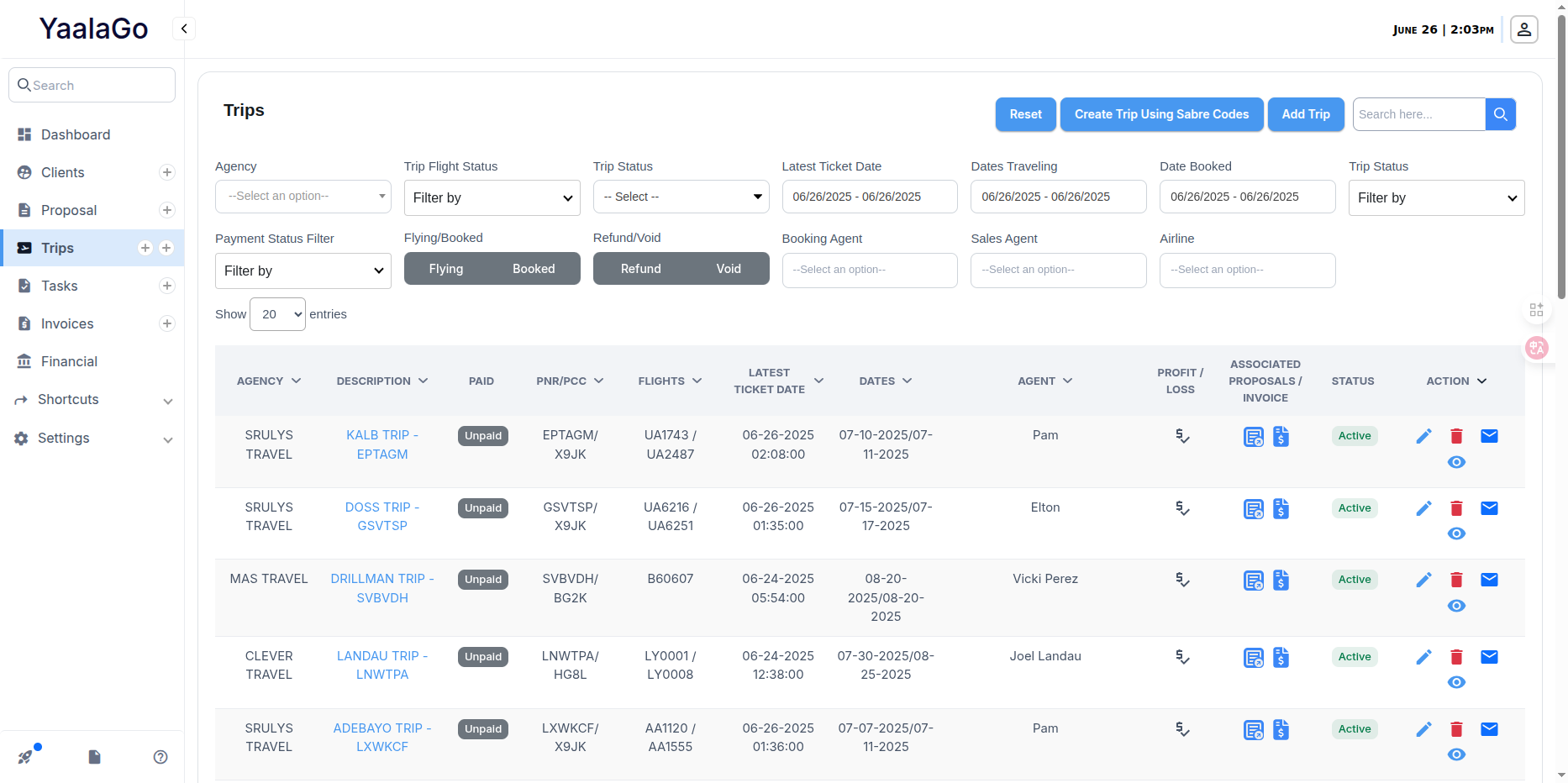
We've made several layout improvements to the trip list to make it easier to scan, especially for users on smaller or zoomed-in screens.
Here’s what changed:
- Payment column now shows as “Paid” and is much narrower. The text “Partially Paid” is now just “Partial”.
- “Internal Booking Code” was renamed to “PNR” and merged with the “PCC Code” column to save space.
- “Flight Info” is now simply “Flights”.
- We removed the “Ticket Issuer” column since it wasn’t being used.
- Date formatting now displays each date on its own line, rather than splitting the date across two lines.
- Agent names will wrap to multiple lines if needed, keeping column width tighter.
We also cleaned up the column header alignment and arrow positioning. Arrows are now centered properly above the respective columns, so it's clearer which field they relate to.
These adjustments should help fit all key data within a single row, even when zoomed in.