Improved Layout for Manual Entry Pages
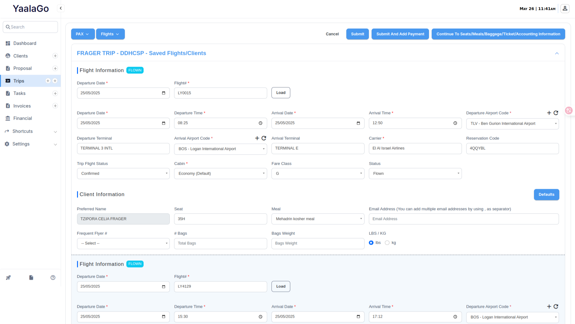
We’ve updated the layout of the unified manual entry pages to create a cleaner, more compact experience. While the request was initially to switch to a popup layout, the team opted to keep the full-page format due to the complexity of the forms and the need to support clonable fields.
Here’s what changed:
- Field widths have been reduced to eliminate unnecessary space
- More fields now fit in a single row, making it easier to view and navigate
- The overall form is now centered for a more typical layout experience
- Visual improvements were made to color and spacing for better readability
This new design is already live on the New Ticket/Accounting page.